Simon Larbalestier’s photographs feature on the covers of the first five studio albums by seminal Boston band the Pixies: intrinsically linked with the band, they are an integral part of their image.
Vaughan Oliver, the graphic designer on those LP sleeves once said: “If there were a ‘fifth Pixie’ it would have been Simon – his work so suited what they were doing.”
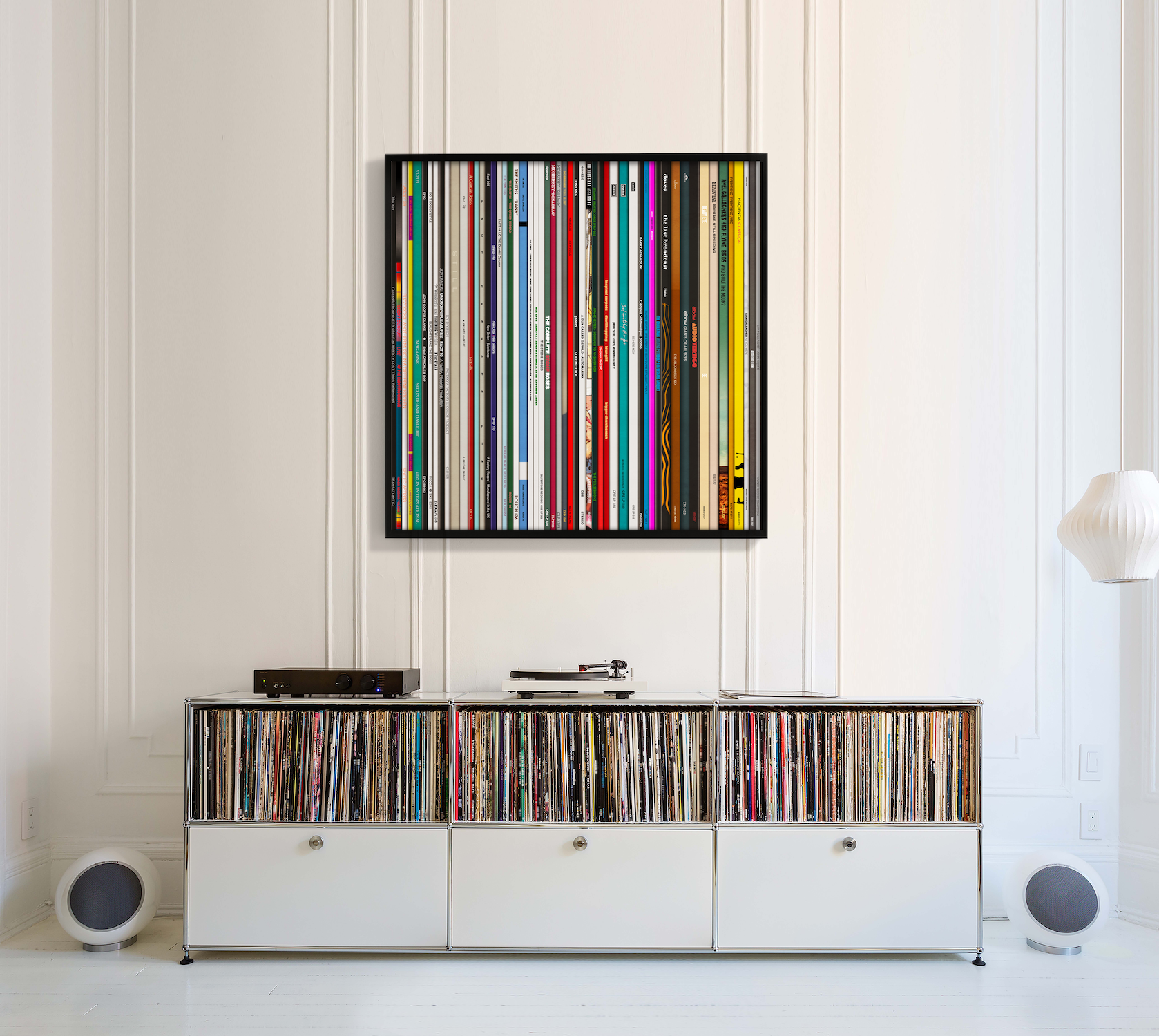
Simon Larbalestier spends much of his time outside the UK, and that limits the opportunity for collectors to acquire signed examples of his work. He is back in the UK in a couple of weeks time, and this means that there is a window coming up where collectors can secure a signed example without delay.
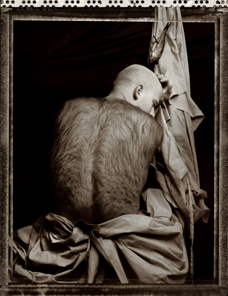
I have always liked this story from Pixies frontman Charles Thompson, aka Black Francis, about the Come on Pilgrim artwork: “I worked at the Windsor button factory down the road from another factory where Joey Santiago worked. The proof of the record cover just showed up one day in a big cardboard envelope. At that moment, I knew that the Pixies were really happening. To me having that album art was the real mark of having arrived. That freak show photograph of the guy with the hairy back told me that things would never be the same again. I quit my job the next day”
Simon’s detailed stories behind the key images are fascinating – read them in full below to find out more.
Nimrod’s Son (1986)
Nimrod’s son
“Nimrod’s Son” was from a series of photographs made during my Master’s Degree at the Royal College of Art, London in 1986. Based on Gustave Flaubert’s book “The Temptation of St Anthony”, the photographs explored themes of death, decay and temptation; themes that were to run throughout future images and even imbue my work of the present day. The title “Nimrod’s Son” was given much later once it had become the sleeve artwork for the Pixies’ debut EP Come on Pilgrim, released in 1987. The story of how this initiated the start of a long-term twenty two year collaboration between myself and Pixies graphic designer Vaughan Oliver is an interesting one. Vaughan and I were both taught by Terry Dowling when we studied Graphic Design at Newcastle Upon Tyne Polytechnic. We were five years apart but both acknowledge Terry as the cornerstone in our visual creative thinking.
Terry had suggested I look up Vaughan on arriving in London to begin my Master’s Degree. Vaughan worked within the 4AD independent record label in South West London, operating at the time as 23 Envelope. This changed to v23 with the start of the Pixies collaboration. We both got on immediately and discovered that we shared a similar visual aesthetic in photographers we admired, and an appreciation of texture and decay. In 1987 when I graduated from the RCA, I invited Vaughan to my degree show. This consisted of two large photographs and two large collages – a bold statement of the two directions I was interested in developing in the commercial arena I was about to enter. The photograph of the man with the hairy back was paired with the image of a flower coming out of a stomach, both of which were from the same series.
Vaughan was looking to commission a photographer to shoot images for the Pixies, a new band from Boston. He felt my work fitted the dark moody feel their music evoked and rather than commission me to shoot new images, he wanted to use these just as they were. For me this struck a deep chord. I had soon realised whilst studying at college that to work for clients was always going to involve some degree of compromise and a dilution of my original photographic vision – very different to making images for one’s own personal needs. In this particular instance I felt I made no compromise because the work was being used in it’s purest form.
So from this premise, Vaughan and I began our collaboration and over the years a deep inherent trust and mutual admiration developed between us. The nailed fish has, over the years, become an in-joke with many of my friends as few could ever see a visual relationship between this and the work of Gustave Flaubert, but it was a variation on a theme related to earlier works of mine that involved fish and crucifixes. Only three sheets of film were ever exposed at the time I made these images and now, years later, only one negative and three Polaroids remain.
Surfer Rosa (1987)
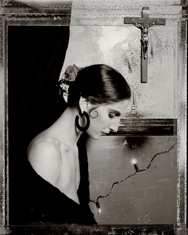
Surfer Rosa 3
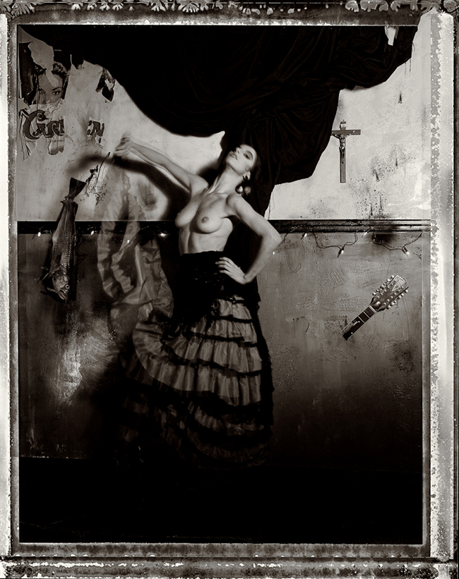
Surfer Rosa 1
The Surfer Rosa series was a collaborative effort between myself and Pixies graphic designer Vaughan Oliver. This was the first time I was to photograph a stranger with a sense of intimacy and candour. Working in a similar way to “Nimrod’s Son” – my title for the photograph used on the cover of the Pixies EP Come on Pilgrim – Vaughan and I hand-built a set in the upstairs function room of a pub in South West London.
We needed a purpose-built, slightly raised, stage so that we could shoot with the set in an elevated position. Years on, Vaughan and my recollections as to the story behind the set differs somewhat (perhaps I misheard the original story) but my interpretation that I carried over the years was that Pixies frontman Charles Thompson (aka Black Francis/Frank Black) wrote some of his songs in bars with a Spanish themes in his hometown of Boston.
I wanted to develop the sense of decay and texture from my earlier images and we laced this with Catholic references (a theme inherent in the Pixies’ music but also deeply embodied in mine from several years before when documenting Greek Orthodox Churches in Greece and Turkey). For added irony we added the nailed fish motif ( carried over from Come on Pilgrim) as well as an original guitar from the band, which we embellished by breaking.
For Surfer Rosa I wanted to retain the distinctive Polaroid edges that we used on the Come on Pilgrim sleeve, so I shot again with Polaroid’s Type 55 – a unique film that yields a positive print as well as a very fine grained negative that can be printed from in the darkroom. There is a discrepancy between the film negative and Polaroid print in that their film speed (ASA/ISO) differs greatly – the print was given a speed of 50-75 but the negative was only 6-12. In layman’s terms this meant that to get a usable negative, one had to over expose the print – not good when requiring the approval of an art director who often had to show a client!
More often than not, several were made at varying exposures: something to suit both client and photographer. Ambient temperature was also a factor, and in the case of the Surfer Rosa session, we were shooting in the middle of Winter, where room temperature was near freezing. This resulted in the negatives being stored in very cold sodium sulphite solutions throughout the day as the shoot evolved. By the time I had got them back to my darkroom, many of the negatives had semi-solarized: in other words, the shadows had partly redeveloped in the freezing temperatures. This was a factor that we were to capitalize on when I made the prints and Vaughan designed the sleeves.
Monkey Gone to Heaven (1988)
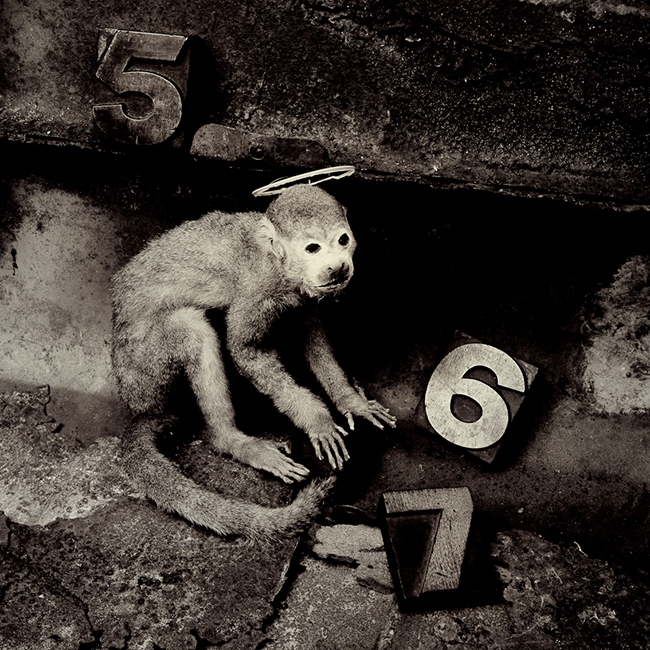
Monkey Gone to Heaven (1988)
“Monkey Gone to Heaven” was the signature image for the Doolittle series. Doolittle, the next Pixies album, was scheduled for release later in 1988. For this LP, the management has asked for artwork ‘in colour’. Their feeling was that we needed to move away from the monochrome look of the previous two sleeves. Graphic designer Vaughan Oliver and I felt differently, and, not being one to compromise, I shot the entire series in black and white! A series of seven images were used in the booklet of lyrics that was included as in insert with the LP, while the Monkey image itself was used both on the Doolittle LP cover, and on the sleeve of the single “Monkey Gone To Heaven”.
My design considerations were practical – I needed to produce a square image for a square LP sleeve. My answer to adding colour was to bleach the edges of the images, enhancing the state of decayed texture that I would shoot the images within. You can see this technique in the original inner sleeve booklet that came with the Doolittle LP. It is important to note here that all these sleeve artworks were specifically built sets – built in front of the camera lens and lit in a very particular way. There was a very personal reason for this: ever since the time I spent documenting churches in Greece and Turkey, I had always made a clear distinction in my head between work shot ‘on location’ and work made in the studio. The location work existed as factual form – the photograph documented evidence of this fact. The images made in the studio were pure fiction created from an imagined world.
The aim of the Doolittle series was to explore this concept in a greater depth and the images were built with elements carefully researched and sourced that related to specific references in the lyrics to individual songs kindly provided by Pixies frontman Charles Thompson in a handwritten fax. Furthermore, I adopted a more purist approach, shooting only one roll of film (twelve frames) per image. So the sets were very precise and carried out with an almost surgical and scientific precision, even down to the choice of very fine grain 25 ASA film stock, so that I could capture as much detail as possible.
The elements this image were simple: a monkey, the numbers ‘5’, ‘6’ and ‘7’ and some reference to Heaven. The heavily textured and decayed backdrops were to run throughout the whole Doolittle series. I chose to work alone on these sets and agreed to show Vaughan the contact sheets once I had completed the shoot. Vaughan trusted me here to make the images and I was more than happy to let him work the design around the images. This was a creative strategy we were to successfully employ on many future occasions.
Spike (1989)
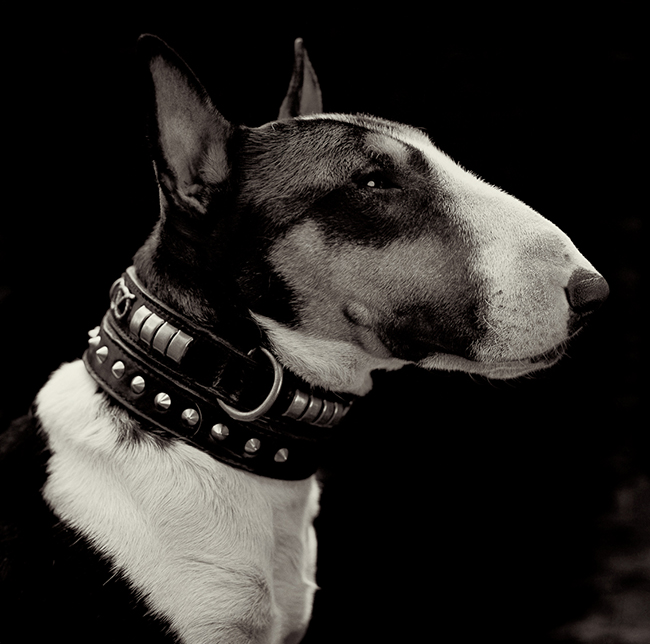
Spike (1989)
The image of the English Bull Terrier “Spike” broke many of the rules we had set up for the Pixies images but it also embodied the implicit trust that Pixies graphic designer Vaughan Oliver had in my visual perception. During most of my time in London in the mid 80’s to early 90’s, I was represented by the Special Photographer’s Company. This was an agency that was both a gallery and commercial agency built into one, and was something quite unique for London at the time. As a group of photographers it enabled us to purse both the fine art photography market and the design, editorial and advertising world from a single base.
To encourage the sense of being a group we often collaborated in group shows. One of these was on the theme of animal portraits in an exhibition entitled “Animal Magic”. This was a subject that none of us had ever really shot before. My choice was a dog, Spike, whom I had come to know very well and who was owned by some friends of mine. On the day of the shoot, both owners, Tessa and Colin, presented me with their preferred choice of dog collar. On seeing them, I elected to shoot Spike wearing both collars together: something neither Tessa nor Colin expected. For me this was a way of enhancing the sense of ownership, and the sense of what the expression “being collared” evoked.
I invited Vaughan Oliver to the opening night of the show, and happened to have with me some of the Polaroids from the shoot a few days before. He happily put one in his shirt pocket, grinned sheepishly and mentioned an upcoming Pixies single that might be called “Here Comes Your Man”. The title of singles was never an exact science in that we never knew which track would be released for a single from an album until the very last minute. So, on the evening of the show, it was not a given that “Here Comes Your Man” would be the selected track. But a few days later when Pixies frontman Charles Thompson (aka Black Francis) received the Polaroid the decision was made. So, ironically, in providing a non-commissioned personal piece for the Animal Magic exhibition, the very of act showing the image resulted in it becoming a commissioned piece. For me this echoed back to my degree show a couple of years before, where my degree show image,“Nimrod’s Son” was selected as the cover for the Pixies debut EP Come on Pilgrim.