DAVID BOWIE: FIVE SESSIONS
PHOTOGRAPHS BY DUFFY
Brian Duffy photographed David Bowie over five sessions between August 1972 and April 1980, and made the iconic Aladdin Sane album cover image.
Brian Duffy defined the image of the 1960s, and was as famous as the stars he photographed. Together with David Bailey and Terence Donovan, Duffy is recognised as one of the innovators of “documentary” fashion photography, a style which revolutionised fashion imagery and furthermore the fashion industry.
Duffy’s most famous photograph dates from January 1973 and is the iconic cover of David Bowie’s album Aladdin Sane. They collaborated on four other sessions during the pivotal years of Bowie’s career between 1972 and 1980, and Duffy’s photographs would appear on the cover of two more David Bowie albums – Lodger, and their final collaboration, Scary Monsters (and Super Creeps). When the king of glam was assuming and discarding extraordinary personas, Duffy was capturing them all.
I hope you enjoy this phenomenal body of work. Duffy passed away in 2010 but collectors can still purchase signed examples of his work, alongside unsigned estate-authorised pieces, all carefully curated by his son Chris. Photographs are available to purchase in limited editions in a range of physical size options to suit your wall space, including some very large format versions with a 40×40 inch image size.
Guy White
Gallery Director

Duffy’s classic Aladdin Sane album cover image
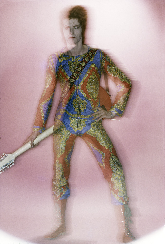
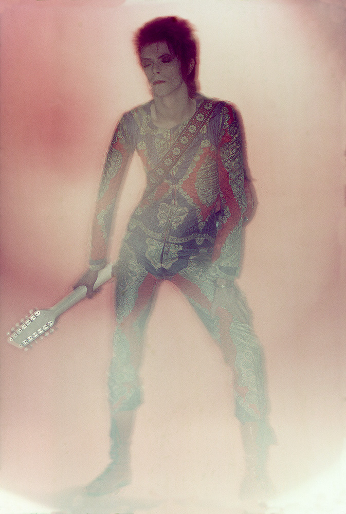
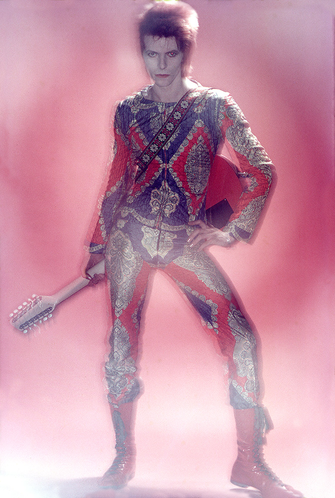
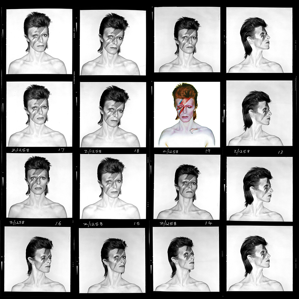
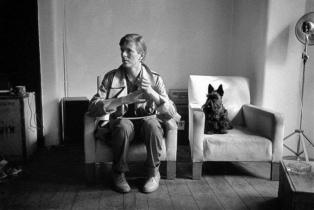
August 1972–Session one–Ziggy Stardust.
The photographs from this shoot were never published at the time–and nobody is really sure why–but they put Duffy in pole position for the cover of David Bowie’s next album.

Duffy was introduced to David Bowie by Tony Defries, who had recently taken on David’s management. Defries and Duffy already knew each other and Defries had several photographers shoot David to assemble a high quality portfolio of images that could be used for promotional purposes worldwide.
David Bowie’s career was in a rapid ascent at this point in 1972. The Rise and Fall of Ziggy Stardust and the Spiders from Mars had been released in June, and his legendary performance of ‘Starman’ on Top of The Pops took place on 6 July 1972.
The session took place in August 1972 at Duffy’s studio at 151a King Henry’s Road, in London’s Primrose Hill. His son Chris recalls: “It was the perfect studio, north light, a massive skylight, 30 foot A-frame roof and huge double doors that opened at the front which allowed you to drive vehicles in. It had three other rooms which became a darkroom, a secretary’s office and Duffy’s private office.”
Bowie arrived at the shoot with the same quilted jumpsuit and red boots he had worn for the Top Of The Pops performance, and also brought a bright red twelve-string Vox guitar. The outfit had been created by London designer Freddie Burretti, who had met Bowie in the late 1960s.
January 1973–Session two–Aladdin Sane.
It has been called ‘The Mona Lisa of Pop’. Who could have imagined that the moment he clicked the shutter on the Hasselblad in early 1973 that one of those images would become known as a cultural icon? – Chris Duffy
Some background to the shoot.
The background stories to the Aladdin Sane shoot are told in rich detail in the book Bowie | Duffy – Five Sessions. In particular it is a delight to read Duffy’s (a self confessed Marxist anarchist) analysis and compare that with the measured tone of Tony Defries. If you don’t have a copy of the book, here’s a flavour of their respective views – which amount to much the same thing – just expressed in different ways.
First up, Tony Defries: “I was looking for an iconic cover image and artwork that would help me to persuade RCA that Bowie was sufficiently important to warrant megastar treatment and funding in order to propel him to exactly that status. Engaging a master, world-class photographer to shoot the project /brand and to design the artwork was the best way to send that message. Brian had the ability to make the mundane image interesting and the interesting image fascinating.”
Then Duffy: “Tony wanted to make the most expensive cover he could possibly get a record company to pay for, because he realised that if it cost fifty quid, well, so what – but if it cost £5,000 the record company were now having to pay attention. He said “Can you make it expensive?“and I said “No problem old love.” I proposed–
One: A Dye-transfer. A genius method of being able to spend the most amount of money to get a reproduction from a colour transparency onto a piece of paper.
Two: Get the plates made, where? Switzerland.
Then employ me to design it and create it – even better and more wasteful.”
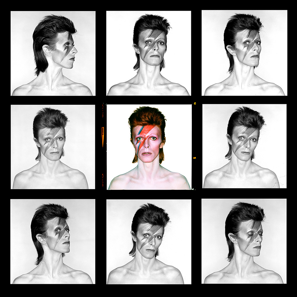
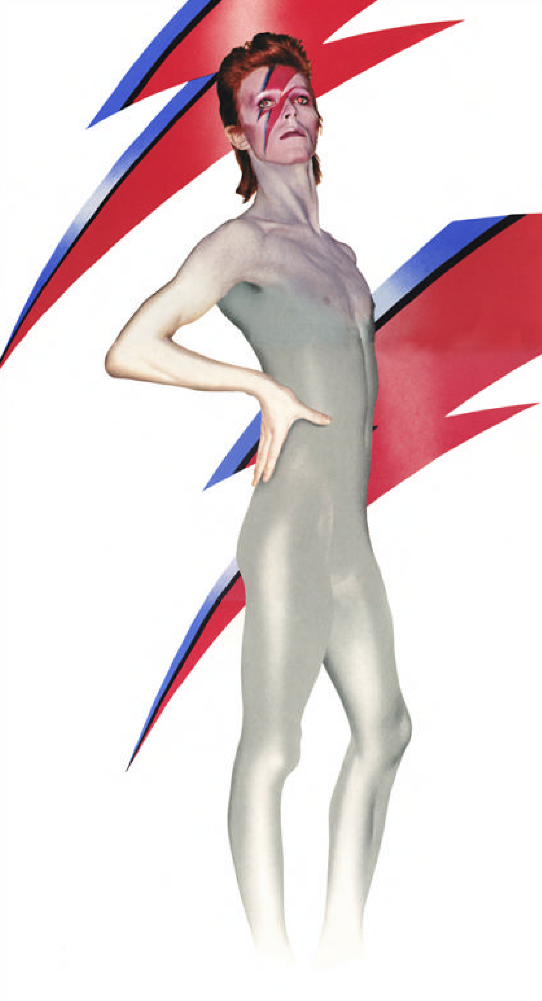
The Aladdin Sane session was a real team effort.
The location was Duffy’s studio at 151a King Henry’s Road in Primrose Hill, London, which had been the setting for the Ziggy Stardust session the previous August. Duffy had agreed with Tony Defries that his design agency, Duffy Design Concepts, which he ran with Celia Philo, would design the sleeve.
Present in Primrose Hill on that January day in 1973 were Duffy, David Bowie, Celia Philo, Tony Defries, French make-up artist Pierre Laroche, and Duffy’s studio manager Francis Newman, who also acted as his assistant that day. Follow-up work on the detailed airbrushing required to create the final artwork was carried out by Philip Castle.
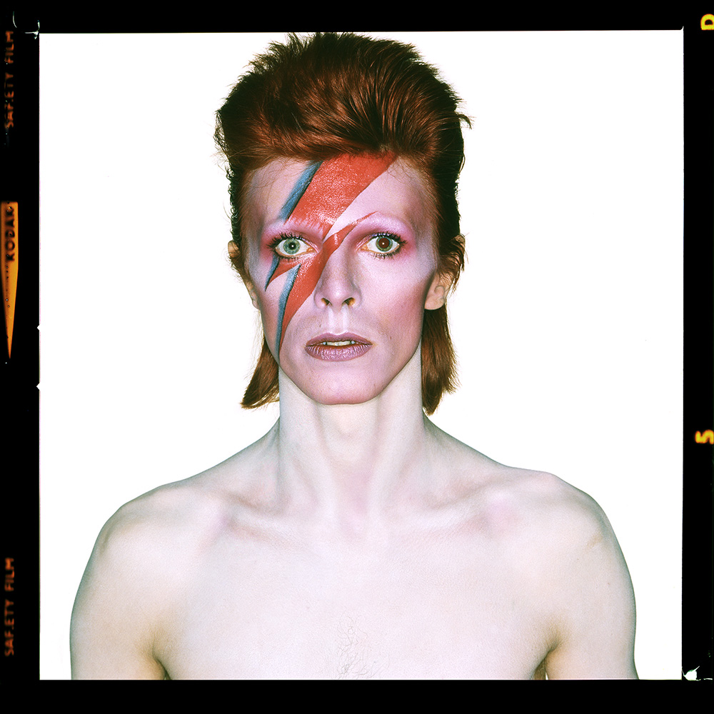
What about that lightning bolt flash and the liquid pool?
The idea for the lightning bolt came from David Bowie. The realisation of that lighting bolt into the form that appeared on the sleeve was down to Duffy. Its source is believed to be a rice cooker that was in Duffy’s studio – and which had a small logo with a red and blue flash.
Francis Newman remembers, “Pierre stared to apply this tiny little flash on his face and when Duffy saw that he said, “No, not like that, like this” and literally drew it right across his face and said to Pierre, “Now, fill that in.””
The red colour was lipstick. Adding the pool of liquid to the collarbone was Duffy’s idea, and this was brilliantly airbrushed in as part of the post-production work by Philip Castle.
David Bowie explained the background to Rolling Stone magazine, that it was a “Lightning bolt. An electric kind of thing. Instead of, like, the flame of a lamp, I thought he would probably be cracked by lightning. Sort of an obvious-type thing, as he was sort of an electric boy. But the teardrop was Brian Duffy’s. He put that on afterward, just popped it in there. I thought it was rather sweet.”
“It wasn’t until we saw the contact sheets the next day I remember thinking, God this is spectacular. You just knew you had cracked it, boy, did you know it.” Celia Philo
Airbrushing
All the airbrushing was carried out by Philip Castle. He had first met Duffy while working on the 1973 Pirelli calendar.
Castle worked his airbrush magic on Duffy’s original dye-transfer prints–one of the most expensive forms of photographic reproduction–which had been made in Switzerland. The original source photograph for the inside gatefold had Bowie standing full length against a white studio background, flanked on each side by six foot high wooden boards, dressed in nothing but a pair of minimal white briefs.
The final airbrush effect extended from ankle to chest, and was included on the inner gatefold sleeve on early pressings of the record. This was only produced for a limited number of copies of the album. Later pressings were only available as a single sleeve.
Castle also worked on the front cover, creating the small pool of liquid inside the collarbone, creating the glow over his chest and upper arms, and airbrushing Pierre Laroche’s make-up to ensure that the flash over David’s right eye lined up either side of the eyelid.
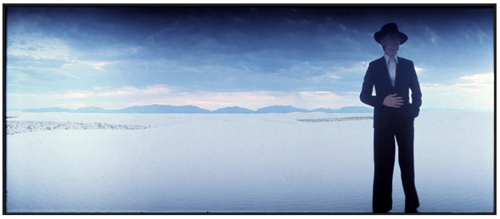
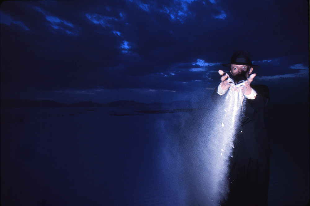
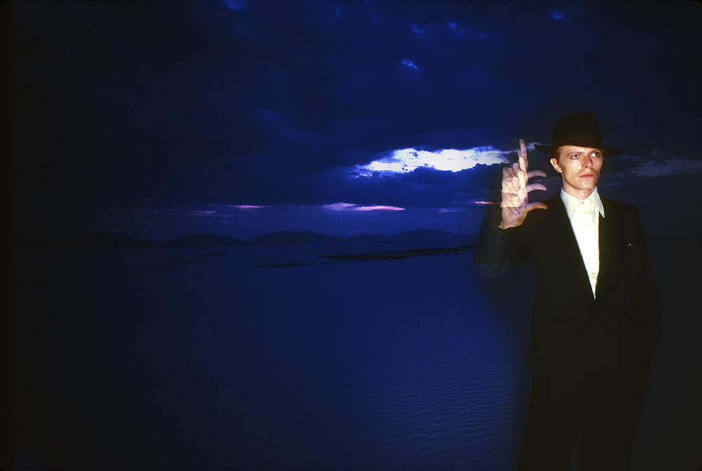
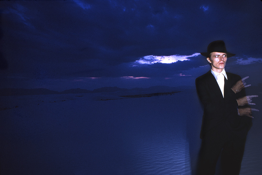
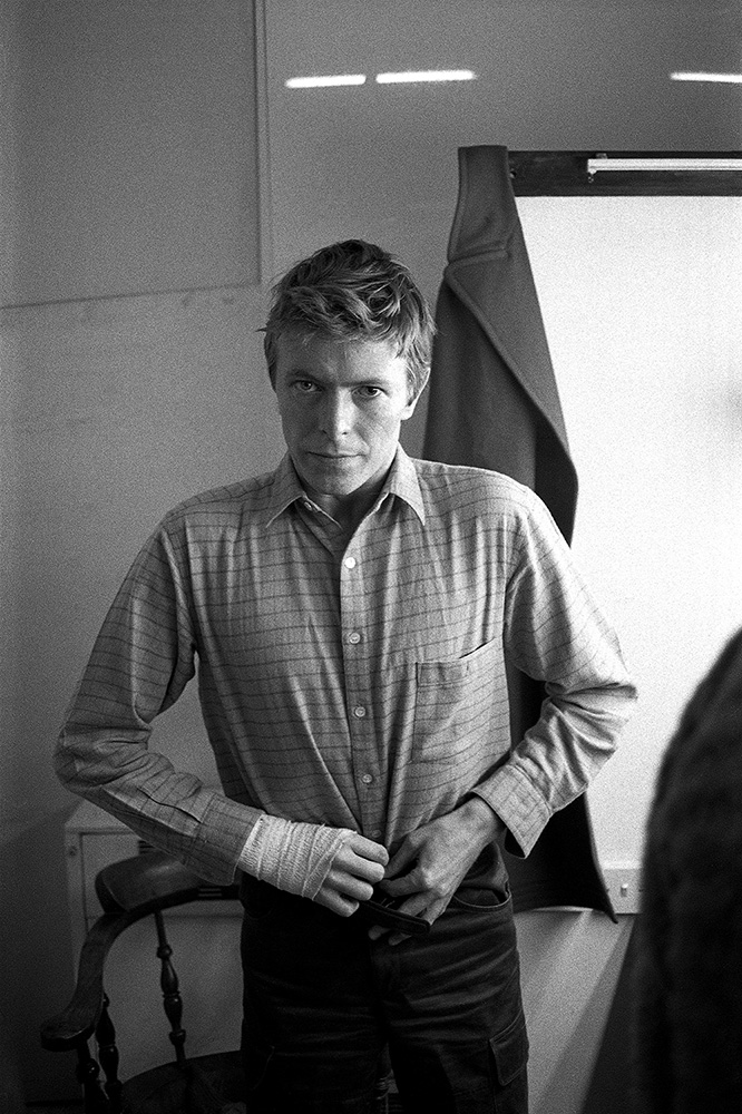
July 1975–Session three–Thin White Duke.
He was a guy who looked so different from everybody else – there would be no way he could walk along a street, even if he wasn’t famous. You would just think, ‘Christ, who the hell’s that?’– George Perry
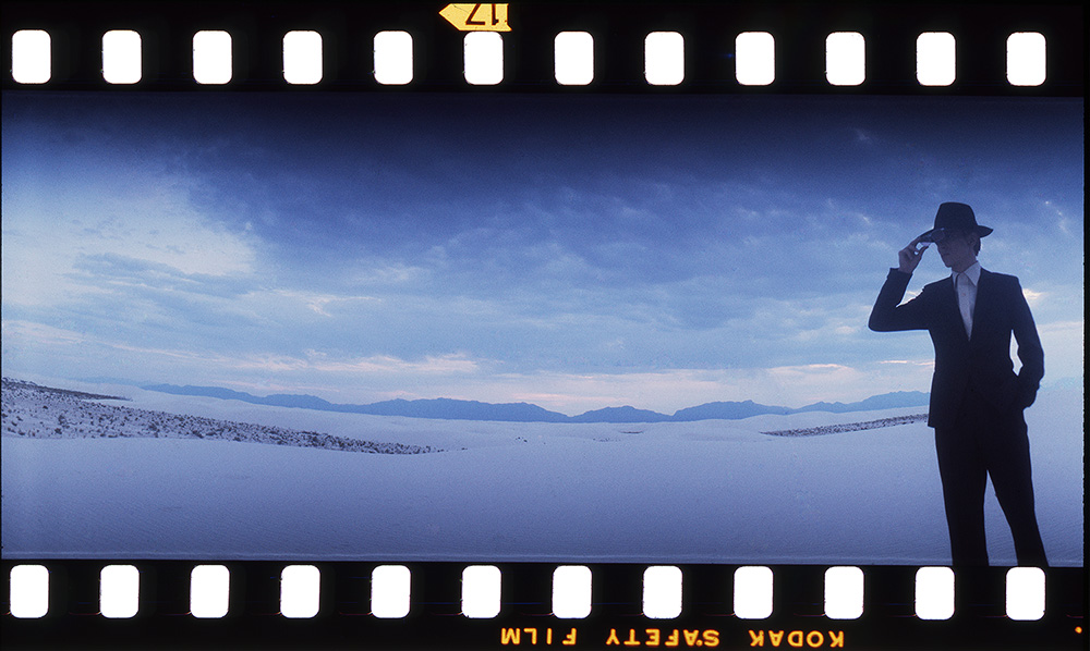
Duffy was commissioned by the Sunday Times to go to the set of the film The Man Who Fell to Earth in New Mexico where David was playing the part of an alien who had fallen to earth.
By this time Duffy and David had become friends and he and Coco (his long-term assistant) were frequent dinner guests in the Duffy home. Duffy managed to persuade David to come out to the White Sands National Monument for a shoot in his ‘Thin White Duke’ persona. David was delayed on set the day of the shoot and these images were shot just as the sun was setting.
Chris Duffy writes in the book Duffy | Bowie : Five Sessions: “The photos we have of Bowie at White Sands are really an interesting set of images. In fact, I think they are my personal favourites of Duffy’s collaboration with David; they’re just so full of atmosphere. And being a photographer myself, I know how easily that session could have failed. They were late to get to the location and the sun was dropping rapidly, Duffy had no assistant, very little time to get it together and would not have had another chance to get David down there if it had all gone wrong. No Polaroid, no autofocus in dim light, a one second, triple flash exposure with movement in the arms while David kept his body dead still – risky, really risky – but that’s the way Duffy played the game, all or nothing. You have to admire that, and to top it all he would not have seen the processed film until he got back to the UK. It looks easy in hindsight but I can tell you I can’t think of many photographers who would take the risks Duffy took, and that’s what set him apart”.

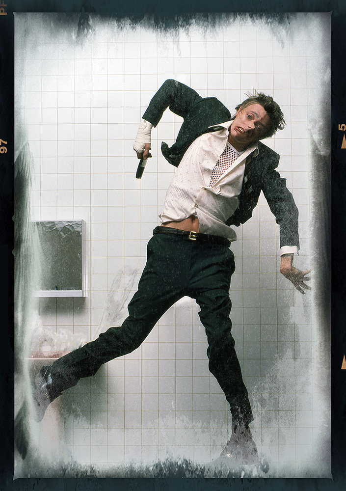
February 1979–Session four–Lodger.
Oh, by the way, instead of using the high resolution photograph I’ve decided to use the Polaroid – David Bowie
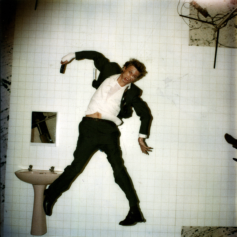
The Lodger cover concept
Lodger was the most technical of all the sessions that Duffy and Bowie worked on together.
David wanted the image to portray a man falling; a man in distress. Duffy had a steel frame built one metre off the ground to support David in this contorted position and separate him from the background. Duffy then took the shot from his studio rafters.
The makeup artist Anthony Clavet stuck fishing line to David’s face, and pulling on the wire distorted his face in the way it would during a fall.
On the morning of the shoot, David arrived with a bandaged hand from a coffee burn. Anthony Clavet was ready to disguise the injury, but David chose to keep the bandage on, as he felt it added to the general feeling of disarray.

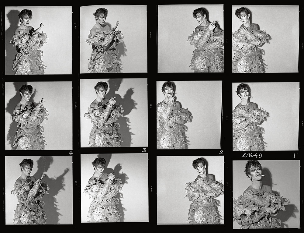
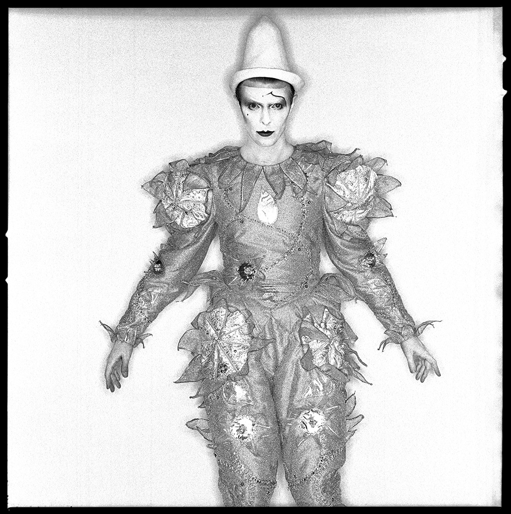
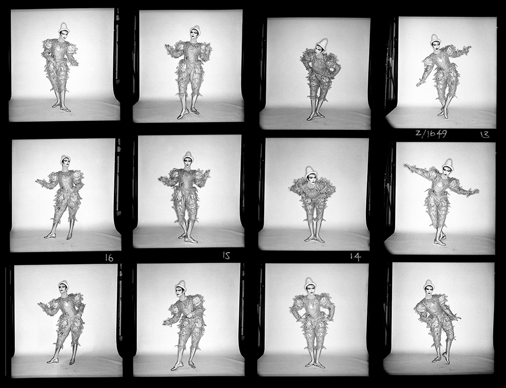
April 1980–Session five–Scary Monsters and Super Creeps.
It was a kooky kind of shoot really, what with three people shooting David and then the record cover ends up as a painting, how mad is that? – Chris Duffy
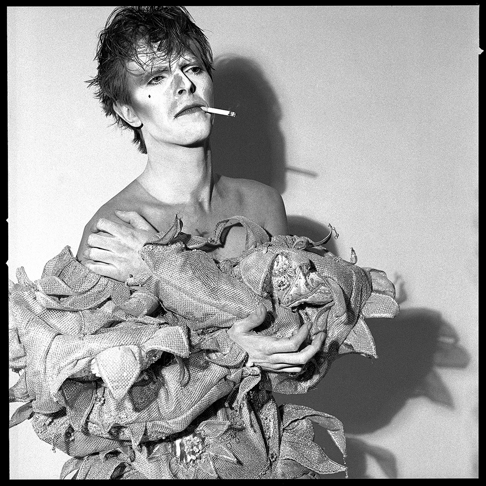

Scary Monsters (and Super Creeps) was the final shoot that Duffy and David Bowie worked on, together with artist Edward Bell. Bell made the paintings that appeared on the front and back cover, and was responsible for the lettering. The clown costume was made by designer Natasha Kornilof, acting on a brief from Bowie to make him ‘the most beautiful clown in the circus’ and make-up was by a prodigiously talented make-up artist, Richard Sharah, who had been introduced to Bowie by Steve Strange.
Duffy and Bell had different expectations from the project. Duffy expected Bell to add colour to one of his photographs for the front cover, while Bell was focused on making a new painting from one of his own photographs. At the shoot both Duffy and Bell took photographs of Bowie.
The end result was an unsatisfying one for Duffy. The portrait that he had selected and presented to artist Edward Bell to paint on had been almost completely obscured by a new painting made by Bell. All that was visible of the Duffy original on the front cover was a hand with a cigarette, and Bowie’s shadow. With the passing of time, however, this has added to the mystique of the Duffy portrait.
Chris Duffy by now had established his own career and studio, and Duffy shot the session in Chris’s studio with Chris assisting. Afterwards Chris took publicity shots of David for the album promotion.

Open editions.
A range of more affordable Duffy estate-authorised prints

The Duffy Archive also release images as estate authorised open editions at more affordable price than the limited edition work. In order to keep the price keen, they are physically smaller than the limited editions offered by the archive, and the editions are not limited.
Window mounted and ready to frame, these open edition prints have an overall mounted size of approx 20×20 inches (50x50cm) and an image size of approximately 10×10 inches ( 27x27cm) for a square image.
Prints are embossed with the Duffy archive stamp, and ink stamped on the reverse with a replica of Duffy’s original studio logo, and sealed in a clear cellophane wrapper.
Shipping charges apply where we ship outside the UK.
If you would like to order a print just click the button, make your purchase and notify us of your chosen image.
The book.
Duffy|Bowie – Five Sessions
